Making Cool Wallpapers
Last Updated: 16/07/2026
Some of my explanations may be confusing. Play around to see what I’m talking about!
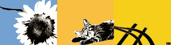
Many people have asked me, over the time I’ve been posting my computer setup, how they too can replicate the “bi/tri-chrome” wallpaper aesthetic that many of my wallpapers achieve. Here I will spill my secrets.
If you would rather me do it, I do take commissions, just email me ;)
The Editor
The image editing software I use for making these wallpapers is Photopea. It’s a fantastic web-based replacement for Photoshop (trying to be 1:1!). While other editors like Krita or Gimp may work, I don’t know how to use them and will be referencing Photopea, so you’ll have to try to “translate” what I’m to your editor of choice.
Gathering Materials
Firstly, you have to decide: what sort of image you want to make and your color pallete.
For images, I just look to what interests me or looks cool. For this example, I’ll use a random cat image. You may also want a collage of images. See here to preparing these images separately and why you may want to do so.
For the color pallete, I personally used to just eyeball it and experiment until I found something which looks good. By now, I’ve gotten decent at it but I highly suggest the Lospec pallete list. It has so many cool schemes which I will definately use sometime later.
You should now create a new image in Photopea in the dimensions of your screen. For me, it’s 1280x1024 or 1024x768 (because thats what I use on my monitors).
The Technique
There are two ways I get that sharp-edged, bi-chromed look that I know of:
PNG Compression
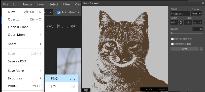
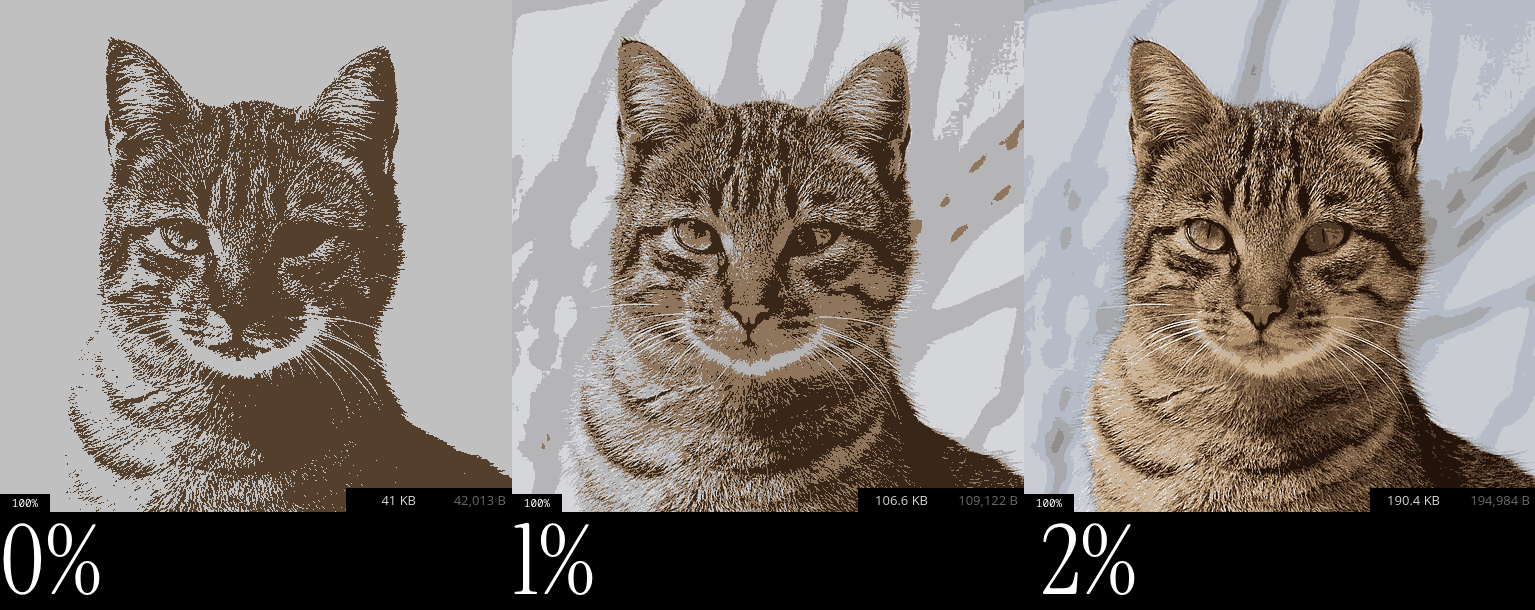
If you paste an image into your canvas and try export it as PNG ([File > Export as > PNG] or [Ctrl + Alt + Shift + S]), you can see a slider for the “Quality”. Setting it to 0% will show you an image which is very sharp; there are only 2 colors in the pallete. Turning this slider up, you can see more color being restored to the image–I usually keep between 0-2%. The reason we only use PNGs (or GIFs) is because the color pallete gets reduced; at 0%, every color gets quantized.
Note Paper Filter
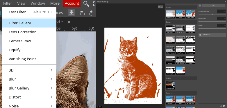
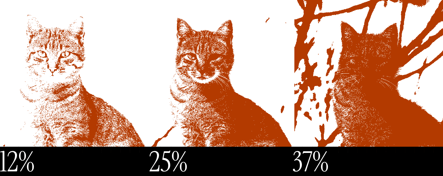
While selecting the image layer, you can do [Filter > Filter Gallery… > Note Paper] then reduce the Relief and Graininess to 0. This will leave you with a similarly, bi-chromic, sharp image. Play around and adjust the slider to see how the image reacts.
After applying this filter, you may still notice blurry edges on your image if it had transparency. That is because this filter preserves the alpha. To fix this, simply paint bucket over the two colors. This will reset set their alpha to that of the color (should be 255). See The Paint Bucket Tool).
The Paint Bucket Tool

You now have your image, but what if you don’t like the colors? By pressing the paintbucket icon, or G, you can access the paint bucket tool. Try copying the options from the image above. Tolerance is how much leeway the tool has. If this is a value greater than 0, you may find similar but different colors being painted the same. Anti-alias should be disabled. It can add a blurring look when you’re painting a certain color. Contiguous is usually disabled for me as it won’t paint any color if it’s cut off.
Now you have it set up, simply select a color from the Color Picker and click the color you want to replace.
Resizing Images
You may find if you resize your image, it gets blurry. To resolve this, resize your image but at the top where it says Bilinear, set that to Nearest Neighbor; this will give you pixel perfect resizing.
Dealing With Smart Objects
When putting an image in, it may be a Smart Object. When scaling these images, they won’t have an option to scale using Nearest Neighbor. To solve this, double click the image, click then drag the layer with the image on into the main tab. You can now delete the Smart Object image.
While they can be very useful, I won’t cover it in this article.
Getting Rid of Backgrounds
Great! We now have our cat image in that nice and crisp format but how about the background? In order to get rid of it, there are two ways I like to do it.
Magic Wand
You will need to get the original image first, ideally in the original resolution too for better results. Click the wand icon or press W.
The Anti-alias option can be enabled (unless you are working with a low-res image)
For our image, however, this method doesn’t work well as the background is very diverse, having a floor, trees and sky.
A good usecase is for removing the background of fake-transparent or white background images, which you may want to collage into your image.
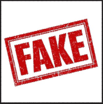
Another way is exporting the image with a ~2% quality then removing the background colors then re-exporting it, but that almost always more effort.
Eraser + Magic Wand
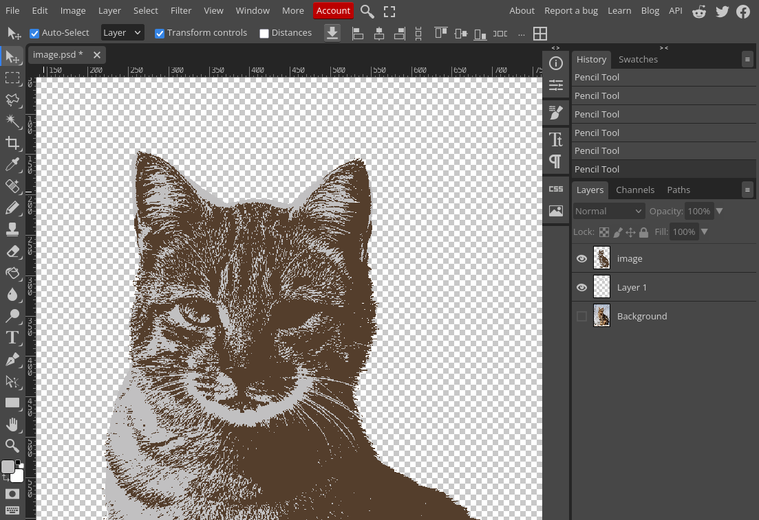
This method may take a bit longer but works really well. Firstly, prepare your image at the quality level you want (I’ll use 0%). Then set Anti-alias to off, Tolerance 0 and Contiguous to on. Now select the background and while holding Shift, select any areas which haven’t been selected. If it bleeds into the subject, find the part where the image which has a hole and color it in. To color, select the Brush Tool or press B, right click and set to Pencil.

Now you can erase. Select the Erasor Tool or press E and set it to Pencil mode. Now you can erase away until you have just the subject left!
Preparing Images Separately
Sometimes, we may want more than 1 image with their own palletes in a mix. Just carry out the pevious processes but individually, then collage them into one.
Text
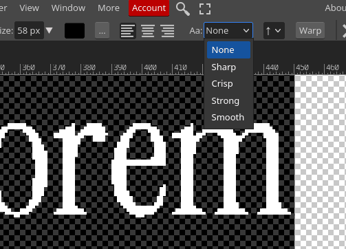
You may want some inspirational quote or whatever on your wallpaper. To do this and fit the aesthetic, select the text tool, find a serif font (I personally like Instrument Serif or one of the *Tex fonts), write your message.
Now select it all and set the Aa to None.
The Final Image
Now simply create a new layer and paint it whatever color you want and layer your image(s) on top!